The Project: As an official production partner at this year’s highly anticipated LeWeb ’11 Conference, JESS3 attended the conference to contribute what its best known for: beautiful data visualizations. The only catch? These infographics would be created in real-time. With the help of data partners Radian6, the JESS3 team created an infographic for each day of the conference using the topics discussed by the world-renowned panelists in attendance as well as the topics most widely discussed in the social media. Our Methodology: Before attending the conference, JESS3’s Art Director and on-the-ground illustrating correspondent Jim Hollander researched all attendees and panel topics thoroughly to ready some pre-designed assets for the potential infographics. While at the conference, using information curated both for its relevance and ability to be portrayed in a way that told the day’s story at-a-glance, Jim Hollander crafted three data rich infographics that will live far beyond the exciting three-day event.
Friday, December 30, 2011
Thursday, December 29, 2011
ROI: Are You Getting Your Money's Worth from Congress?
Before we spend money on something, what’s the first thing we ask ourselves? What are we getting out of this? Whether it’s a mother buying groceries for her family or an investor buying stocks, it all comes down to return on investment. We should be asking the same thing when it comes to our tax dollars. We spend trillions of dollars funding the government every year, it’s only prudent to step back and consider what we’re getting for it. Our latest infographic takes a crack at this. But rather than breaking down the entire federal government, we examine if we’re getting our money’s worth from Congress.
Comparing Hot Dog and Beer Prices at Baseball Parks
This infographic provides the prices of food and amenities at different major baseball stadium around the U.S. It shows a lists of receipts to breakdown the amount of money you would spend at different stadiums during a game. It also provides data for the total amount spent at baseball games in 2010 and 2011.
Six Years and a Thousand Students
This infographic is based on a survey on youth on education taken from students at Stanford University. The infographic provides data for the number of students in the U.S. Then it provides the results of the survey based on finding out what students study, what influences them, and what they think about the education system.
Wednesday, December 28, 2011
Couchsurfing, catching the wave of sharing
Couchsurfing is all about sharing. Experiences, culture, chats and games are in the mix and it's not just a way of cheap travelling or free accommodation as some have mistakenly portraited it. Lower travelling expenses are just a collateral consequence but not the meaning of it. Couchsurfing is a new way of travelling and also a way of living and understanding the world. This is my infographic about that
2010-2011 NHL Fantasy Draft Who to Avoid
This infographic provides information for the players to avoid drafting during Fantasy NHL. They list the the players that missed games or got injured during the 2010-2011 season adn their list of injuries or issues in order to inform Fantasy NHL players to avoid drafting them so that they don't ruin their lineup.
Inbound Marketing Rising
This infographic provides a list that compares the style of inbound marketing to that of outbound marketing. It shows how the rise of inbound marketing has began since the advent of the internet and therefore outbound marketing is slowly declining. It also explains how inbound marketing works and tips on how to establish successful inbound marketing projects.
Tuesday, December 27, 2011
All About Social Media Monitoring Tools
This infographic provides information abou the different tools out there today that are used to monitor social media sites for businesses. It provides information about who is buying SMM tools, how much it costs and how satisfied users are with them. It also lists the best SMM programs and divides the best ones by cost.
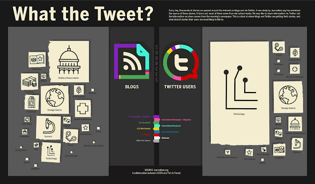
What the Tweet?
This infographic provides information for where bloggers and Twitters get the stories that they write and tweet about from. It shows that although blogging and Tweeting are new forms of media the stories that people post are from forms of old school media such as the newspaper. This infographic shows where the stories come from and what kind of stories are being blogged and Tweeted.
Seeking Refuge a Glance at Refugees Worldwide
This infographic provides information about refugees worldwide, refugees are people who have fled their home country because of war, famine, or natural disasters and are living in other countries waiting to go home. This infographic provides information about the number of refugees by country of origin, total number of refugees in the world, the number of refugees per USD of GDP, per square kilometer and per 1,000 inhabitants in several countries.
A History of Twisters in America
This infographic provides information about tornadoes in America. First it provides a map that shows how many tornadoes have hit and in which states. Then it provides statistics for the top deadliest and most damaging tornadoes. Finally it provides a brief description and pictures to show how a tornado forms and develops.
Monday, December 26, 2011
Christmas History Tradition
Across the world, Christmas is celebrated in a multitude of rich and cherished traditions. Their origins are wonderfully varied, emerging out of cultures and beliefs throughout history. This illustrated timeline, brought to you by Balsam Hill, captures the flow of some of the most popular Christmas traditions and figures and traces their simple lineage from St. Nicholas’ humble beginnings to today.
Subscribe to:
Posts (Atom)


